How we improved our workflow by piping sql
NOTE: my original blogpost was published in the Movio blog . I’ve had to steal it because it went offline for a while, the link sometimes 404s, and they’ve broken some links. I don’t want it to be lost. The following content is unchanged from the original.
TL;DR
Since we began our transition from Scala to Go , we discovered that when there’s no right tool for the job, we can make a rough one ourselves in an hour or two. If it makes sense we can iterate on it until it becomes something the whole team can use, then the whole company, and then, sometimes, the whole world.
In this blog post, I’d like to share two of these tools: sql and chart , that we’ve been using a lot lately. Together, they compose an interesting pattern for tinkering with multiple databases individually or concurrently within the terminal.
Introduction
The Movio Cinema SaaS platform has grown to manage the marketing campaigns of almost 60 of the biggest cinema chains worldwide in only a few years. This feat has not come without a few interesting challenges.
In the early days, it was relatively easy to provide good quality support in a timely manner with few developer resources. Recently, it has become necessary to get creative in order to accommodate the volume of incoming support tickets, without sacrificing proactive support and the development of new and exciting projects.
When presented with a support situation, sometimes outside office hours, it’s important to diagnose quickly. Given the nature of our issues, much of our support work takes place in the terminal, and our toolbox is based on Linux’s coreutils . Most of the time, we’re working with remote MySQL databases, Cassandra clusters, Kafka clusters and microservices deployed as Kubernetes pods onto several AWS data centers and availability zones.
Almost everything that we do to maintain this infrastructure and resolve support issues can be achieved by a clever composition of coreutils, following the UNIX philosophy .
Over time, we’ve incorporated several additional useful tools. Notable examples are ag for fast grepping and jq for parsing JSON.
What about MySQL?
When working with MySQL, however, for years we have lacked these sorts of practical ad-hoc interactions. Why was MySQL different?
The MySQL client is not intended primarily for composability, given:
The database we’re interested in generally runs on a remote machine
The MySQL client is interactive
It outputs results in a format that makes it easy to read but hard to pipe
Here’s a query ran on a MariaDB client:
MariaDB [test]> SELECT * FROM (SELECT 1, 2, 3) t;
+---+---+---+
| 1 | 2 | 3 |
+---+---+---+
| 1 | 2 | 3 |
+---+---+---+
1 row in set (0.00 sec)
We can work around these impediments:
mysqlobviously allows us to connect to a remote database, provided you grant the (appropriate permissions)[https://dev.mysql.com/doc/refman/5.7/en/grant.html] to the user within the MySQL server and allow the remote incoming connection on the server’s firewall.
$ mysql -h remote.movio.co -P3306 -u mariano -pmypass db
- We can use the
-eflag to supply a query to the client. When this flag is supplied, the client is not interactive.
$ mysql -h remote.movio.co -P3306 -u mariano -pmypass db \
-e"SELECT * FROM (SELECT 1, 2, 3) t"
+---+---+---+
| 1 | 2 | 3 |
+---+---+---+
| 1 | 2 | 3 |
+---+---+---+
- To get an output we can use, we can add the
-N(skip column names),-s(silent, less output) and-r(raw output, tabular format) flags.
$ mysql -h remote.movio.co -P3306 -u mariano -pmypass db \
-Nsre"SELECT * FROM (SELECT 1, 2, 3) t"
1 2 3
That’s much better. We can now, as an example, pipe the output to tr and bc to sum them up:
$ mysql -h remote.movio.co -P3306 -u mariano -pmypass db \
-Nsre"SELECT * FROM (SELECT 1, 2, 3) t" | tr "\t" "+" | bc
6
Even though we can now apply the whole coreutils toolbox on the output of any query, there are still two important issues with this approach:
The previous line is way too long to be convenient for ad-hoc queries.
The production database password is all over the bash history file.
We can solve both issues with a bash function:
$ function m() {
   mysql -h remote.movio.co -P3306 -u mariano -pmypass db -Nsre"$1"
}
And then we can just:
$ m 'SELECT * FROM (SELECT 1, 2, 3) t' | tr "\t" "+" | bc
6
But this idea only works for a specific database; if we want to query a different one, we need either another function or at least one argument.
Enter sql
Hoping to address all these issues, we built a simple Go CLI tool called sql . At the time of this writing, it was basically a ~200 LoC main.go.
sql reads from standard input until an EOF (it assumes the content is a MySQL query) and then sends the query to one or multiple databases, and outputs the results in a tabulated format.
Using sql, the previous example becomes:
$ echo "SELECT * FROM (SELECT 1, 2, 3) t" | sql remote | tr "\t" "+" | bc
6
sql requires a configuration file with the database locations and credentials. The previous example assumes you have a configuration file that looks like this:
{
 "remote": {
   "dbName": "db",
   "dbServer": "remote.movio.co",
   "pass": "mypass",
   "user": "mariano"
 }
}
It can query multiple databases in parallel (using goroutines). To disambiguate output when multiple databases are queried (which doesn’t necessarily come sorted), the database name is added as the first column of each line.
$ sql remote1 remote2 <<< "SELECT name FROM red_squad ORDER BY id DESC LIMIT 3"
remote1    Lucian
remote2    Isaac
remote1    Gary
remote1    Mariano
remote2    Mikhail
remote2    Am
Use sql all to query all the databases in your configuration file.
Additionally it supports the case where your local machine doesn’t have permission to connect remotely but you have ssh access to a server that does; in this case sql will first ssh to the server, and then connect to mysql.
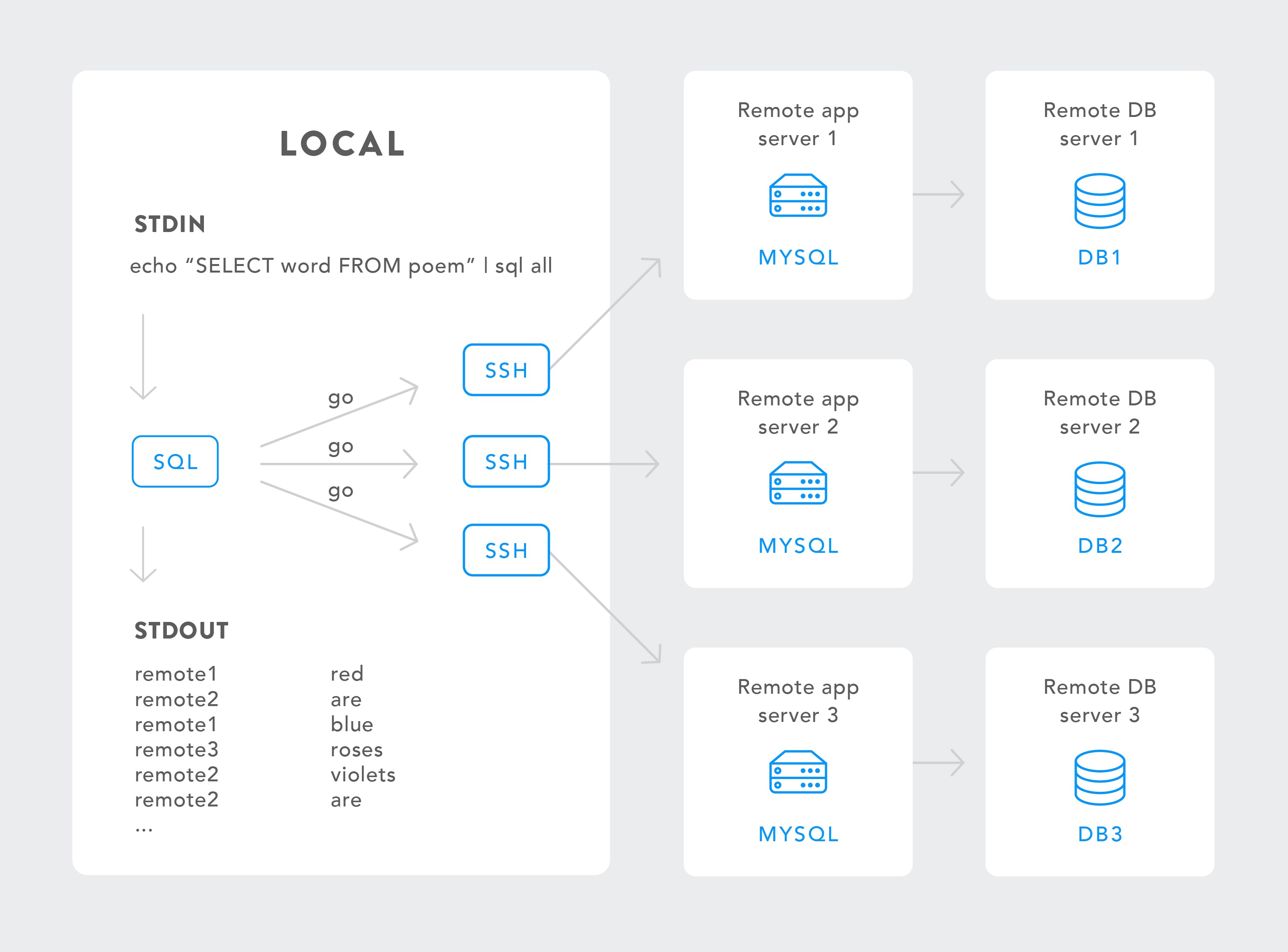
Note that sql depends on the mysql client and optionally ssh. When ssh is used, the mysql client must be installed on the remote server.
What happened next
While this shiny new tool made querying faster and more convenient in some cases (e.g. not needing to ssh to a remote host, not having to type hostnames and username/password), it also enabled some important new ones - like being able to compare or assert something across many or all of our databases.
In doing so, we found that, sometimes, the result of a query, multitenanted or not, is not easy to interpret in plain text. Sometimes charts are better than data tables for humans.
Here’s an example that we have come across
At Movio, we send hundreds of millions of emails and SMS every month. Every once in a while, something goes wrong with some marketing campaign, and we need to figure out what is happening, fast.
Say, for example, we receive an email through support about unusual deliverability results for a marketing campaign, for cinema exhibitor named “ABC”.
If the issue were a failure to execute a marketing campaign, or one being stuck while sending communications, we would immediately look for alerts on our campaigns infrastructure, and keep an eye on suspicious activity on our monitoring dashboards. In this case, however, the campaigns seem to be executing, but the results are not as expected.
I’ll propose a three-step process for this investigation:
The first thing to do here is scope the issue; is this happening to every client or just ABC?
After de-risking, we need some context. How are ABC’s campaigns performing? Is this situation really an anomaly?
Finally, we can really delve into the root cause of the issue.
Let’s say we have the following table (one of these for each of our customers, spread across dozens of database servers):
CREATE TABLE Campaigns (
   sentCount INT,
   utcSent TIMESTAMP
)
An intuitive query to find the results for the campaigns sent in the last seven days would be:
SELECT sentCount, utcSent FROM Campaigns
WHERE utcSent > DATE_SUB(UTC_TIMESTAMP(), INTERVAL 7 DAY)
Of course, doing this on every single database would take forever, so we can use sql instead:
$ echo "SELECT sentCount, utcSent FROM Campaigns
 WHERE utcSent > DATE_SUB(UTC_TIMESTAMP(), INTERVAL 7 DAY)" | sql all
Unfortunately, the resulting dataset is relatively hard to read and interpret:
ABC  184063  2017-05-20 15:08:37
JKL  14161 2017-05-20 12:02:49
DEF  1510620 2017-05-20 11:02:59
DEF  16923 2017-05-17 17:58:23
ABC  63502 2017-05-17 17:57:09
MNO  245708  2017-05-17 17:48:57
GHI  16959 2017-05-17 17:32:21
...
There are ways around this at the expense of reduced information and extra complexity of the query, which can in turn come with unintended mistakes. A year ago this would have been a different trade-off, but Moving to Go has been a wide paradigm shift for us: now complexity weighs heavily in the equation, because clear is better than clever .
What we need for this is a scatter plot. Is there a simple way to get one from this output?
Enter chart
Linux has a world-class charting tool called gnuplot . It’s super powerful and covers all chart types and features exhaustively, but it’s also slightly inconvenient for quick ad-hoc charting. It’s a little hard to learn . I must admit, I haven’t given it a fair shot as I find it too complex.
Instead, we built a very simple charting tool called chart
. It reads data from standard input (e.g. the output from sql), figures out the format and opens a browser tab with a chart of the data. For the actual charting it uses Chart.js
, which is the simplest, most lightweight decent charting library we could find.
chart has only a very limited set of smarts and modifiers. The key is to keep it simple and only implement what we use.
For step one (de-risking), we need a scatter plot of send counts from the last week of every customer:
X-axis should be the date
Y-axis should be the send count
Different customers should be identified by colour
Some customers send a lot more communications than others, so we need a logarithmic scale on the Y-axis to see useful output
All this is remarkably simple to do in chart:
$ echo "SELECT sentCount, utcSent FROM Campaigns" \
 "WHERE utcSent > " \
 "DATE_SUB(UTC_TIMESTAMP(), INTERVAL 7 DAY)" | sql all | \
 chart scatter log mysql
(the mysql argument is an alias of --date-format "2006-01-02 15:04:05", and was added because it’s a very common occurrence)
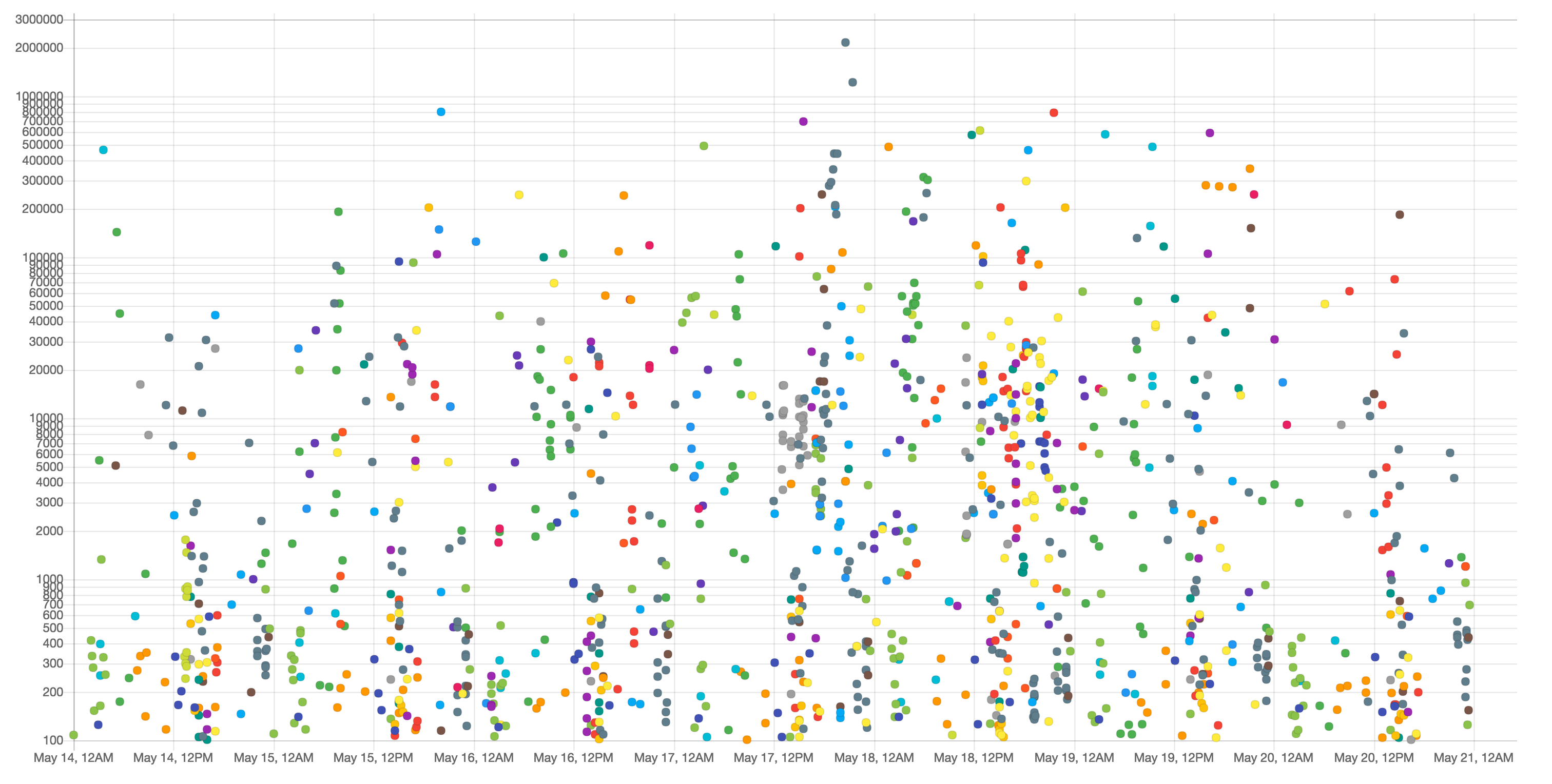
We’re not seeing a sudden drop in send counts across the board, so it’s safe to go to step two: getting some context for this particular customer.
$ echo 'SELECT sentCount, utcSent FROM Campaigns WHERE ' \
'utcSent > DATE_SUB(UTC_TIMESTAMP(), INTERVAL 2 MONTH) ORDER BY ' \
'utcSent DESC' | sql abc | chart line mysql --zero-based
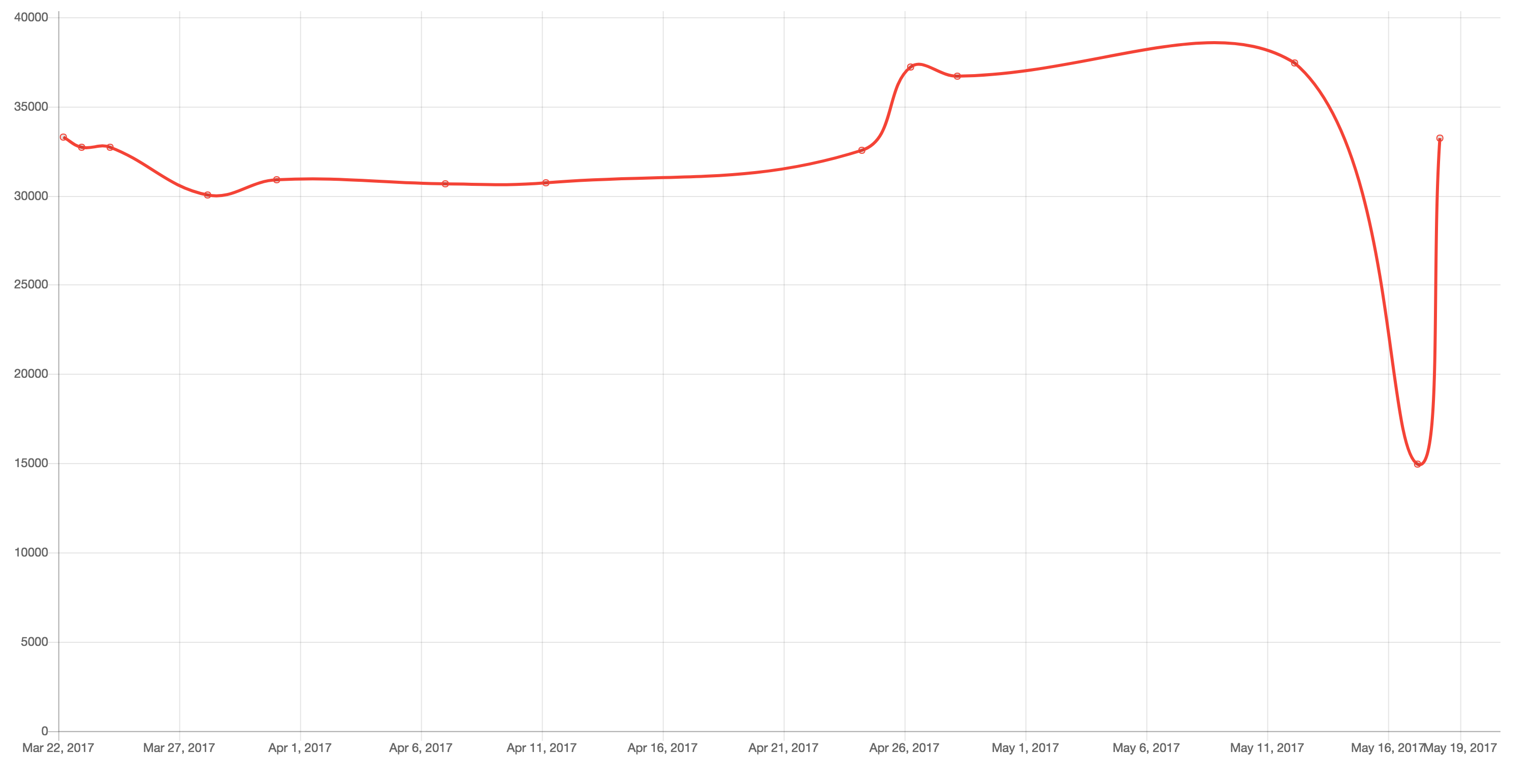
Clearly, something is going on with this particular campaign near the end of the curve. In this case, we can resort to a structured log file where we list send failures. The file looks like this:
{"utcInserted": "May 17 17:47:17", "reason": "hard_bounce", "campaignId": "3055", "customer": "MNO"}
{"utcInserted": "May 17 17:47:34", "reason": "soft_bounce", "campaignId": "123", "customer": "ABC"}
{"utcInserted": "May 17 17:48:02", "reason": "feedback", "campaignId": "58373", "customer": "DEF"}
{"utcInserted": "May 17 17:48:02", "reason": "hard_bounce", "campaignId": "123", "customer": "ABC"}
...
With a little jq magic we can filter out the logs we’re not interested in, and just output the reason for each failure:
$ jq -r 'select(.customer == "ABC" and .campaignId == "123")` \
`| .reason' /var/log/failures.log
soft_bounce
hard_bounce
hard_bounce
network_timeout
soft_bounce
...
Identifier frequency is also a very common use case, so when chart receives a list of strings it assumes you want a pie chart with each distinct string as a category and its frequency as a slice of the total.
We can just pipe that output to chart:
$ jq -r 'select(.customer == "ABC" and .campaignId == "123")` \
`| .reason' /var/log/failures.log | chart
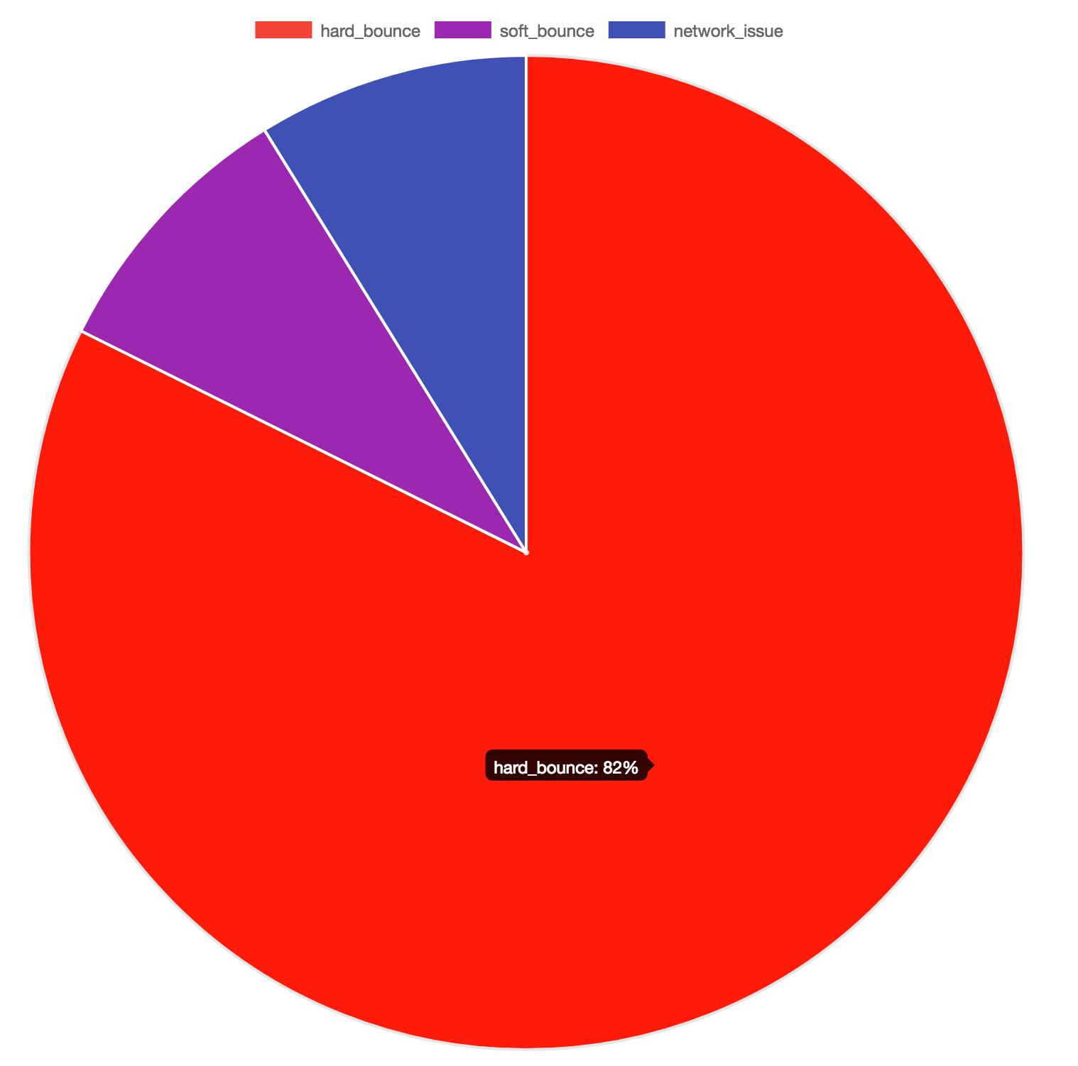
Hard bounces seem to dominate the failure reasons. Network timeouts tend to have a more systemic effect, so this result is not unexpected. Possible explanations are:
One or more of our mailservers has been blacklisted
The campaign was addressed to a poorly managed address list
The email content has triggered third party spam checkers
There is still some work to do, but we’ve made a pretty comprehensive initial diagnosis and have ruled out bigger potential threats in just a couple of lines on the terminal.
Some of the advantages of this workflow include:
Being able to query all databases at once made it possible to rule out a more serious issue. Otherwise we may have checked only the particular customer’s database and overlooked the root cause.
We touched on the surface of what this allows. Think of the wealth of tools in coreutils, and what the different chart types can reveal. Pie and bar charts can be summarized quite well on simple tables; but line charts and scatter plots can show complex correlations that are invisible on matrices for humans.
Gotchas
If you plan to try sql and chart for your workflow, you should probably read this section first.
Read-only is best
sql should be used with care; especially against multiple databases. Everyone makes mistakes, and sql allows you to multiply your destructive power! If you don’t have it already, create a database username with read-only permissions, and use this one with sql.
Even read-only can be dangerous
Remember that MyISAM tables will perform a table-level lock on reads
. Even on InnoDB, please don’t SELECT * FROM users on your entire set of databases!
Timing queries
sql doesn’t output query running time like the MySQL client does. However, you can use the time coreutils tool like this:
$ time sql test_db <<< "SELECT COUNT(*) FROM users"
real    0m6.624s
user    0m0.020s
sys     0m0.034s
Note that these figures include the whole time spent by the sql process, including outputting to stdout, which the MySQL client doesn’t include.
Watching SHOW PROCESSLIST
If you want to double-check that a query is running on some database server, sql gives you an easy way to inspect queries running for that schema:
watch "echo 'show processlist' | sql my_db"
Which you can further grep to wait for your specific query:
watch "echo 'show processlist' | sql my_db | grep 'FROM my_table'"
Learning chart should be very easy
chart encourages you to learn on demand and by example.
There are 3 simple ways to learn how to use it:
Look at the cheatsheet . This shows example data, commands ran and resulting chart for common use cases.
Try it! Pipe your data to chart and try the few available options.
Distrust it. Add the
--debugoption to check howchartinterpreted your input. You’ll get an intuition for how it works.
The cheat sheet is produced by a Go test file and it’s updated on every automated release, so there’s no way it can get outdated. It’s a pretty solid piece of documentation!
Closing thoughts
With sql and chart, we’ve found a convenient pattern for quickly diagnosing our support issues. If your work revolves around databases, I think it might be useful for you. Data Scientists might draw a parallel to using matplotlib
on Jupyter Notebooks.
Currently, only MySQL is supported. It looks like adding support for PostgreSQL, for example, would be a two hour job. However, I’m not planning on it as we wouldn’t be able to test it on a daily basis, like we do with MySQL now. But you can! sql and chart are open
for contributions
.
In the same vein, chart will probably not support complex use cases. In those cases, you’re better off with gnuplot, Excel or Google Sheets; use the right tool for the job.
sql and chart are free and open source. We hope you find them useful! If you can, please help us to keep them simple and useful as time goes on and we face new interesting challenges. Thank you for reading this blogpost. KISS!